
OVERVIEW
Role: UX/UI Designer
Tools: Adobe XD, Optimal Sort, Google Sheets
Application: Mobile iOS
This mobile app is designed to assist adults seeking genuine medical/health advice and consultations. It allows users to virtually connect with our medical professionals within a wide variety of health fields. SimpleHealth facilitates personalized one-on-one experiences as if they were consulting in person to receive evidence-based feedback.
I was inspired through my patients and healthcare colleagues who would spend more time setting up telehealth visits with physicians and therapists. The amount of struggle I witnessed, not just on a technical level but questioning whether using certain platforms were secure and HIPPA-compliant were profound. By utilizing the design thinking framework, I was able to focus on meeting the needs of our users and create solutions to eliminate pain points.
PROBLEM
Problem Statement
Our users need a way to seek medical advice because they are unable to book or wait for in-person appointments due to the on-going pandemic. We will know this to be true when we see users engage with our medical experts via telehealth and messaging system to seek professional and appropriate consultation.
Project Goals
To create an accessible platform for all users to connect with medical experts and get immediate answers without having to go through the hassle of booking and waiting.
RESEARCH
Competitive Analysis
In order to create an app where you could effectively ask questions and also to be able to initiate a video call, I've looked at two very different competitors out on the market. I tested and SWOT analyzed both "Okayso" and "HealthTap" mobile apps, where one focused on specifically asking questions and the other was more well-rounded that included voice/video calls and messaging system. I discovered inspiration and different opportunities to fill in the gaps for this project.

User Interviews
I conducted interviews with four different participants. They were all pleasant and cooperative throughout the process. Each interview session took about 15-20 minutes, as expected, and learned some valuable information contributing to their frustration. The data was then analyzed and organized with affinity mapping to create themes to understand their needs, frustrations and behaviors.
Users are seeking medical/health advice and information from online sources such as Google search and videos.


Many users seem hesitant to initiate scheduling appointments due to the preconception that medical offices would be book or not worth their time due to non-urgent issues, and the uncertainty of reliability.
On average, the participants spent a few hours a day doing their own research to find answers or to educate themselves about the issues they are dealing with.


Users were not satisfied with the amount of time spent researching and would question the legitimacy of the articles and websites providing the information.
All participants favored in the option to virtually consult with their doctors instead having to make an in-person appointment for most of their concerns.

PERSONAS & JOURNEY MAPS
Following the research process, I've gathered and analyzed data to create two personas, Chris & Scott, for this project in order to pinpoint my design focus into our user's needs and a way to remind myself who I am designing for. Chris is the younger, athletic type user and Scott is your senior who is still working endlessly. The specificity of my design will cater for user's to achieve their goals with maximum efficiency and eliminating frustration.


Scott and Chris both have potential scenarios where my SimpleHealth users will likely come across. I've created their user journey above to understand their thoughts and emotions while navigating through the task phases in order to modify my design as needed to minimize pain points.
IDEATE
Card Sort
I conducted a digital card sorting session via “OptimalSort”, collecting data from 5 out of 10 participants. A closed card sort method was taken for this study with predefined categories to determine whether app contents need to be rearranged and to better understand the preconception of my participants. There were a total of 16 cards with 5 main categories.


Site Map
The results from the card sort helped me properly structure my app's site map to what makes most sense for users. Site map has been adjusted throughout the design process such as changing category names to further simplify and make understanding easier for all users.
PROTOTYPE DESIGN
Low-Fidelity Wireframes
I started out my prototype design process with paper sketches in order to focus on the app's main functionality. I put emphasis on the main features: ask a question, signup/login, virtual call pages as my users will be using these sections the most.


Mid-Fidelity Prototype
I used Adobe XD for this design project to create a clickable prototype. The objective was to create a minimalist design and simple enough for everyone to understand. As I witnessed my patients try and use their smart phones, it was frustrating to see how much they were struggling to understand and navigate telehealth apps.
High-Fidelity Prototype
Prior to iterating to a high fidelity, I've conducted a usability test (shown below) where I re-assessed the problems my participants were facing, through expression, behavior changes, and observations. There were some minor issues such as distractions and not understanding what certain buttons did to major issues such as the search bar not doing what they expected it to do.

Latest Iteration
TESTING
Usability Test
My mid-fidelity prototype was put through the test as a moderated in-person and remote study amongst 6 participants recruited within my personal and professional networks. I compiled all my observatory data using the Rainbow Spreadsheet and classified error severity using the Jakob Nielson Rating Scale. Updates were then implemented in my next design iteration leading into high-fidelity prototypes.
Test Objectives
● Observe user navigation and understand the experience of initiating different features.
● Determine if users could get in contact with a medical expert using one of our key features.
● Assess how users find answers to their questions.
● Determine if users could get in contact with a medical expert using one of our key features.
● Assess how users find answers to their questions.

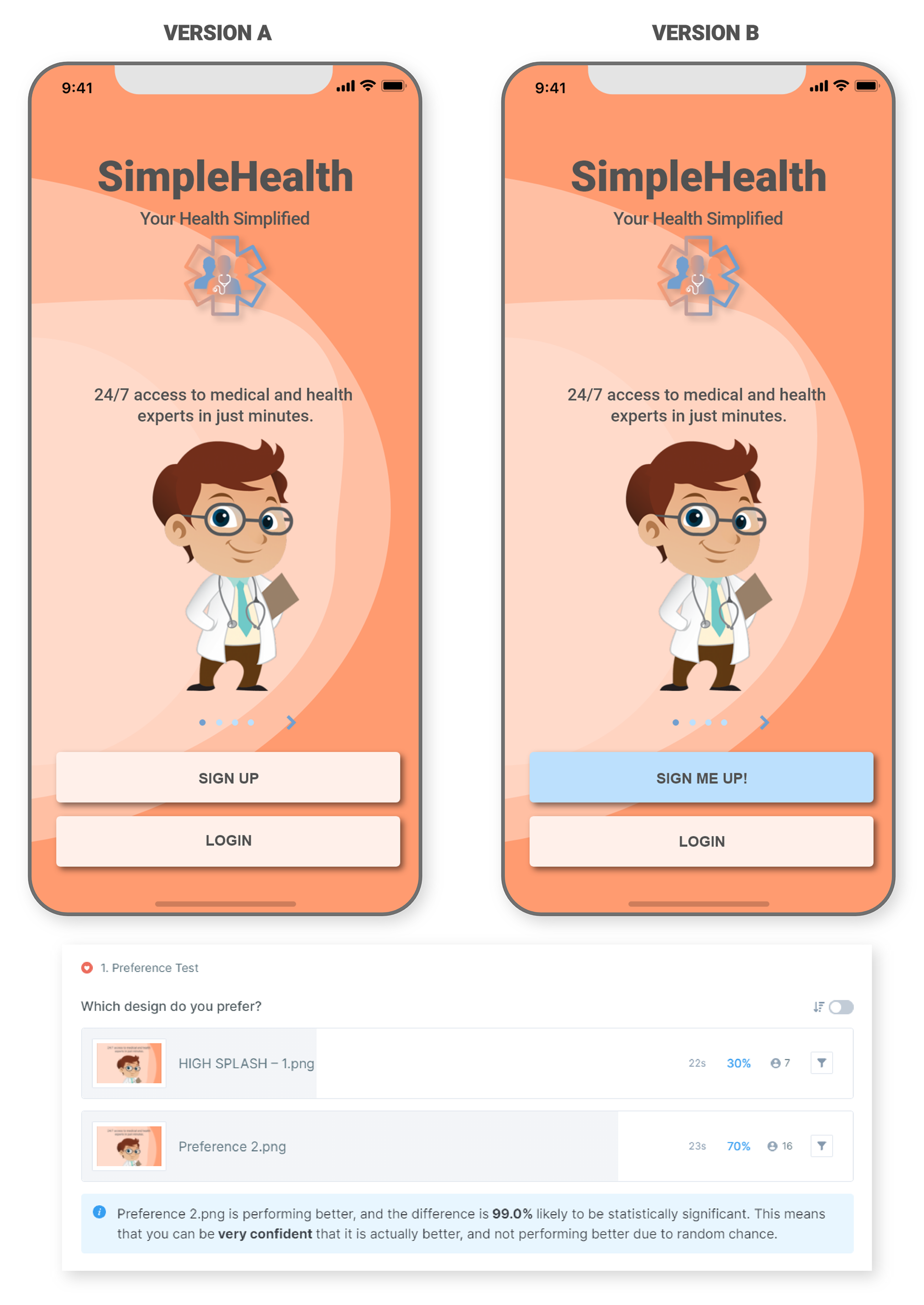
Preference Test
A question I asked myself during one of the earlier iterations is what color button do users prefer? Based on the data, 23 people participated in this preference test and results reflected 70% of them chose option B and 30% chose option A. We can conclude that option B is statistically the clear winner but this test taught me more than a button just being blue. I realized CTA buttons needs to be more attractive and contrast better with the background with the goal to increase conversion rates. Users will be less likely to hunt and be facilitated to sign up quicker.
STYLE GUIDE & LANGUAGE

INTERACTIVE PROTOTYPE

CLICK SCREEN TO LAUNCH PROTOTYPE
TAKEAWAY
The research process of interviewing and testing really helped me understand the issues users were facing during this Covid-19 pandemic. I've learned, with the limited time I had, to stay productive, efficient but most importantly to set my sights on the user's end goals and their emotions.
Sticking to design frameworks, setting key objectives and time frames only helped me to refer back to my user personas and be reminded who I am designing for. I now know to continue to question my design justifications and user test them to continue to improve beyond their expectations.
CREDITS
Special thanks to Wesley Casswell & Joshua Weber and to all the participants who generously took part in this project's research study.
